Oct 6, 2021

[Photography] Photoshop Elements vs Photoshop: Which Editor Is Right for You? (2021)

The post Photoshop Elements vs Photoshop: Which Editor Is Right for You? (2021) appeared first on Digital Photography School. It was authored by Megan Kennedy.

Photoshop vs Photoshop Elements

Which editor should you pick, Photoshop Elements vs Photoshop?

It’s a tough question, and the answer will depend on your post-processing preferences. In this article, I’ll break it all down for you; I’ll compare and contrast Photoshop Elements and Photoshop and see where they both fit in the grand scheme of image editing.

By the time you’re finished, you’ll know which program is the better buy!

Let’s get started.

Photoshop Elements vs Photoshop: overview

Photoshop has become the industry standard for editing on Windows and MacOS systems – so much so, in fact, that the phrase Photoshop is now used as a verb. Photoshop gives users the ability to create and enhance photographs, illustrations, and other digital media. As a critical utility for graphic artists, photographers, designers, web developers, etc., Photoshop has become an integral part of many creators’ processes.

The Photoshop layout
Layout of Photoshop 2021

So where does Elements come in? Photoshop Elements is a simplified version of Photoshop, designed primarily for photographers who want a quick and easy way to edit and organize images. The program came out in 2001 (long after Photoshop first debuted), and is also great for consumers who are just getting started with photo editing.

The Photoshop Elements layout
Layout of Photoshop Elements 2021

While there are numerous incarnations in the Adobe Photoshop and Photoshop Elements lines, for this article, I’ll compare the most recent versions: Photoshop Elements 2021 vs Photoshop version 22.3.0.

Photoshop Elements vs Photoshop: key features

Now that you’re familiar with the purposes of both Photoshop Elements and Photoshop, let’s take a detailed look at what these two programs offer, starting with:

Price

While both Photoshop Elements and Photoshop are owned by Adobe, the sales models couldn’t be more different.

Adobe Photoshop Elements is sold as a one-off program, and the 2021 version will set you back about $100 USD. Photoshop Elements can be bundled with Premiere Elements 2021, a simplified video editing software (see the screenshot below). Upgrade pricing for existing Elements customers in the United States is also available.

Photoshop Elements pricing

Adobe Photoshop, on the other hand, is offered only as a (monthly or yearly) subscription. At present, the best value is the Creative Cloud Photography Plan, which includes Photoshop, Lightroom, Lightroom Classic, plus 20 GB of cloud storage, and costs $9.99 USD per month.

Creative Cloud pricing for Photoshop

Note that Adobe offers a 30-day trial of both Elements and Photoshop if you’d prefer to try before you buy.

Ease of use

Although Elements and Photoshop offer many overlapping features, Elements is geared toward an audience looking for a newcomer-friendly editing application.

Photoshop is the industry standard, but this can make it harder to approach for first-time users. Enter Photoshop Elements, which is designed to enable simple, streamlined editing processes while maintaining an accessible interface. This simplified application can help ease a budding creative into the world of digital editing without plunging them headfirst into a sea of pixels.

Bottom line: Photoshop is designed for in-depth, manual editing operations. Elements is a photo processor, better suited to quick and easy refinements that don’t require intensive editing.

Workspaces

Photoshop offers six pre-made workspaces for different creative requirements: 3D, Essentials, Graphic and Web, Motion, Painting, and Photography.

Photoshop Elements divides the editing process into three workspaces: Quick, Guided, and Expert:

Quick

In Photoshop Elements, Quick view is a simplified interface with basic adjustments. This layout lets you quickly perform common editing tasks and includes basic photo editing tools neatly distributed across the workspace.

Quick mode enables users to access the Healing brush, fix exposure, sharpness, color, and lighting, and even provides the option to apply effects, filters, enhancements, textures, and frames.

Elements Quick interface
The Quick interface of Adobe Photoshop Elements.

Guided

The Guided workspace offers step-by-step instructions for Photoshop Elements users. With over 50 tutorials and counting, this workspace will help you apply a range of effects to a photograph.

Elements Guided interface
The Guided interface with editing functions to select.

With the option to introduce Tilt-Shift, Black and White, Orton, and Lomo effects (and many more) to an image, Guided provides a user-friendly interface for applying relatively customizable effects.

To access these tutorials, switch over to the Guided interface in Photoshop Elements, pick an effect, and go from there.

Black and White effect Elements
The Guided interface with the Black and White effect in action.

Expert

Expert mode is designed for users who are more experienced with image editing. The Expert view unpacks all of the editing tools available in Photoshop Elements and neatly organizes them around the user interface:

The Expert view in Elements.
Photoshop Elements interface in Expert view.

Expert mode has an expanded range of tools compared to Quick mode, enabling you to apply complex editing effects. Draw and Enhance tools, Graphics, Layers and Styles, Histograms, additional Filters, History, and more are all available in the Expert workspace.

Other tools and functions

While Photoshop Elements packs a considerable amount of power, some tools are still reserved for Photoshop. For instance, chromatic aberration correction, which fixes unwanted fringing, is a Photoshop exclusive.

Elements doesn’t support vector formats, either – so the Pen tool, which creates advanced paths and shapes, is not an Elements feature. (Because Photoshop supports vector and raster files, users can add vector-based Smart Objects into a Photoshop file.)

In addition, Elements doesn’t offer the Content-Aware Patch tool (which sources nearby content to blend a region with the surrounding image area) or the Channel Mixer (which is often used for advanced black and white conversions).

Other significant differences include the lack of 16-bit and 32-bit image support in Elements. Lens geometry profiles aren’t included in Elements or in the accompanying (and also pared-back) Camera Raw utility.

Sample moving photo

A new feature in the 2021 version of Elements is the AI-powered Moving Photos function (used to turn static pictures into moving GIFs, as displayed above). While GIFs can be created in Photoshop, the process is a little less streamlined, though Photoshop does offer more flexibility in making these GIFs.

Printing

An additional point of difference in the Photoshop Elements vs Photoshop comparison is printing. Unfortunately, Elements is missing a few key features for professional print production. Unlike Photoshop, Photoshop Elements can’t export files in CMYK, and the program also excludes in-depth soft-proofing.

Plus, Elements supports a simplified color management system compared to Photoshop; while Elements has RGB, Grayscale, Bitmap, and Indexed Color, Photoshop features all of the aforementioned color options, but also Duotone, CMYK, Lab, and Multi-Channel, which allows for greater control when printing.

Elements vs Photoshop: the two programs compared
A game of image modes! Photoshop on the left, Photoshop Elements on the right.

Time management

Photoshop can be more labor-intensive than Photoshop Elements, though the number of guided edits available in Photoshop Elements do streamline the process.

However, although Elements includes quick, automated processes and adjustments, it sometimes sacrifices the manual customizability and creative precision achieved through editing in Photoshop. Put simply, the hands-on approach of Photoshop can pay off, depending on the level of tweaking you require to create an effective image.

Photoshop Elements vs Photoshop: final words

Photoshop can create stunning photographic work, but that doesn’t rule out the capabilities of Photoshop Elements. While Photoshop Elements offers to do the heavy lifting with a few clicks of the mouse button, Photoshop proper offers a larger range of detailed editing features.

Ultimately, if you’re looking for a simple editing program, Elements works well. However, creative professionals in need of precision editing software should jump for Photoshop instead.

Photoshop Elements vs Photoshop FAQs

What is the difference between Photoshop Elements and Photoshop?

Put simply, Photoshop Elements is a simpler version of Photoshop. Elements is easier to use but lacks the full-fledged creative control that Photoshop delivers.

Who uses Photoshop Elements?

Photoshop Elements is primarily aimed at beginner or intermediate users looking to edit photographs. Professional photographers and designers generally invest in Photoshop for more in-depth editing capabilities.

What are some features in Photoshop that aren’t in Photoshop Elements?

There are a good amount of utilities available in Photoshop Elements, but some tools are still reserved for Photoshop. Chromatic aberration correction, the Content-Aware Patch tool, and the Channel Mixer don’t feature in Elements. Elements doesn’t provide vector format or 16-bit and 32-bit image support. Lens geometry profiles aren’t included in Elements or in the accompanying Camera Raw utility. Photoshop Elements can’t export files in CMYK, Lab, Duotone, or Multi-Channel color modes.

How much does Photoshop and Photoshop Elements cost?


Adobe Photoshop Elements 2021 costs around $100 USD for a full license. Photoshop is only available as a subscription, which costs $9.99 USD per month (at minimum).

The post Photoshop Elements vs Photoshop: Which Editor Is Right for You? (2021) appeared first on Digital Photography School. It was authored by Megan Kennedy.


it's from Digital Photography School https://ift.tt/3a9ShKn
via Megan Kennedy

Oct 5, 2021

[Photography] Rule of Thirds in Video: The Essential Guide

The post Rule of Thirds in Video: The Essential Guide appeared first on Digital Photography School. It was authored by Jaymes Dempsey.

rule of thirds in video: the essential guide

The rule of thirds is a simple composition technique that can instantly enhance your videography, but how does it work? And how can you use it to improve your videos in post-production?

In this article, I’ll explain everything you need to know about the rule of thirds, from the basics – what it is and how to follow it – to more advanced techniques, such as how to apply the rule to real estate footage, landscape footage, wedding footage, and more. 

I’ll also explain how to adjust your compositions in VideoProc Vlogger, the just-launched, beginner-friendly video editing software from the company behind the popular VideoProc program. (Bonus: It’s completely free!)

So if you’d like to improve your videos in the field and in the editing room, then let’s dive right in, starting with the essentials:

What is the rule of thirds in videography?

The rule of thirds is a compositional guideline designed to make your visuals more balanced and dynamic.

Specifically, the rule states that the best compositions position key elements a third of the way into the frame. It comes with helpful gridlines:

Rule of Thirds in Video: The Essential Guide

The idea is simple, at least in theory. When faced with a scene, you – the videographer – should position key elements somewhere along the gridlines, and when possible, at the intersection of two gridlines.

(These intersections are known as power points, because they improve your compositions even further.)

So if you’re shooting a mountain at sunset, you might position the horizon line along the lower horizontal gridline, then make sure that the camera pans until the main mountain peak falls across a power point. Make sense?

The rule of thirds isn’t really a rule – just a guideline. But it is a great way to make your videos look professionally composed, and it’s a technique used all the time in movies, TV, commercials, and more.

In other words: You don’t need to follow the rule of thirds religiously. But if you can learn to incorporate it into your shooting – if you can learn to think in terms of the rule of thirds gridlines as needed – then your footage will improve dramatically.

Now, you can apply the rule in two basic ways:

  1. You can plan out your shots using the rule of thirds, then keep your subjects aligned with the gridlines while recording.
  2. You can record, then crop to satisfy the rule of thirds (when editing).

If possible, it’s best to nail the composition in-camera; that way, you don’t lose resolution during post-production. However, if you’re shooting at high resolutions and exporting at low resolutions, or you aren’t too obsessed with pixel-perfect quality, you can always adjust your footage to nail the rule of thirds after your shoot is over, as I discuss in the next section:

Applying the rule of thirds in VideoProc Vlogger: step by step

VideoProc Vlogger is a powerful new program designed to make video post-production quick, easy, and intuitive, plus it costs nothing. You can download the software here.

And in VideoProc, literally anyone can use the rule of thirds to enhance their photos; all it takes is a few simple clicks. Here’s how it works:

Step 1: Prepare your footage for editing

Once you’ve launched VideoProc Vlogger and started a new project, you’ll need to bring your clips into the Media Library. 

Simply drag and drop the relevant files onto the Library panel:

Rule of Thirds in Video: The Essential Guide

Or tap Add Video, then browse through your files for the relevant footage:

Rule of Thirds in Video: The Essential Guide

Then drag the clips down to the Timeline:

Rule of Thirds in Video: The Essential Guide

And you’re ready to go.

Step 2: Add horizontal and vertical guides to approximate the rule of thirds

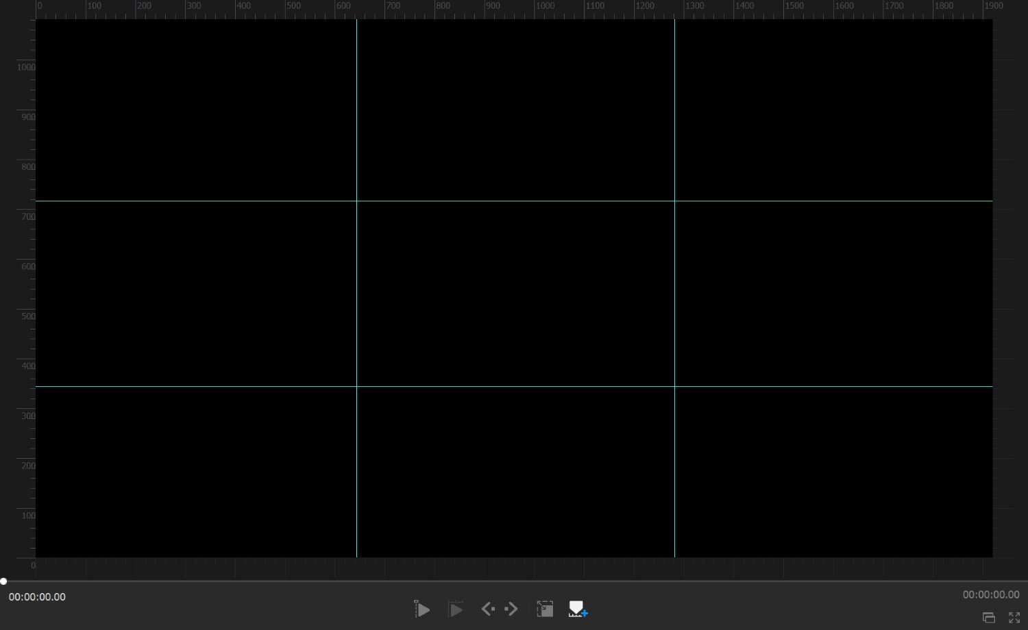
VideoProc Vlogger allows you to easily create guides on your preview screen. Our goal is to recreate the rule of thirds gridlines, like this:

Rule of Thirds in Video: The Essential Guide

First, you’ll need to identify the dimensions of your frame. For this example, I’m working with a 1920 x 1080 (HD) video. (If you’re not sure, you can always check the desktop file, or you can click the little i Info button on the clip thumbnail in VideoProc.)

Second, take the width and divide it by 3. Do the same for the height.

To use my example, 1920 divided by 3 equals 640, and 1080 divided by 3 equals 360.

Next, make sure the Show Rulers button is selected:

Rule of Thirds in Video: The Essential Guide

Tap the Horizontal Guide button:

Rule of Thirds in Video: The Essential Guide

Then place two horizontal guides: one at around 640 pixels, and the other at around 640 x 2 (1280) pixels. 

Finally, tap the Vertical Guide button and place two vertical guides: one at around 360 pixels and the other at around 360 x 2 (720) pixels.

Rule of Thirds in Video: The Essential Guide

And there you have it: a rule of thirds grid, right in your Preview panel.

If you’re worried about accidentally adjusting your guides, you can always hit the Lock Guide button:

Rule of Thirds in Video: The Essential Guide

Step 3: Use the rule of thirds to evaluate (and crop) your footage

Once you have your rule of thirds gridlines in place, I recommend playing through your footage, paying careful attention to key elements, including:

  • Horizon lines
  • People
  • Bright, eye-catching objects
  • Any other main subjects

Ask yourself: Are these key elements frequently aligned with the rule of thirds gridlines? If the answer is “Yes,” then you’re doing great – but if you come across a clip where the answer is “No,” you can simply select the Crop tool:

Rule of Thirds in Video: The Essential Guide

Then adjust your footage until it’s rule-of-thirds compliant. 

Pro tip: If possible, ensure the aspect ratio of the crop matches the original aspect ratio of the footage; otherwise, you’ll need to scale the footage (and you’ll lose parts of the frame in the process).

When should you apply the rule of thirds in VideoProc Vlogger?

While you can technically use the rule of thirds at any stage in your editing process, I highly recommend you add the gridlines and evaluate your composition at the very beginning of your workflow. 

Compositional arrangement tends to affect everything about a recording, from its mood to its ideal color grade to its ideal speed, so it pays to determine exactly how your composition will look before proceeding with any other edits.

Case studies: how to apply the rule of thirds in real-life situations

Up until this point, I’ve explained how to use the rule of thirds, but I haven’t talked much about common situations you’ll run into when filming and how you can use the rule of thirds to enhance your footage.

Let’s take a look at a few likely scenarios:

Real estate videography

In real estate filming, you’ll want to pay careful attention to a few features, including major appliances, eye-catching furniture, wall lines (i.e., the point where one wall ends or intersects with another), and floor lines (i.e., the point where the floor intersects with the wall).

Aim to position wall lines along vertical gridlines and floor lines along horizontal gridlines:

[rule-of-thirds-video-14]

You can also position appliance and furniture edges along the gridlines and (ideally) at power points, like the kitchen island in the example above.

By the way, it’s generally better to pan than to capture static shots, but make sure you move into the final composition. In other words, pan until the scene meets the rule of thirds, then cut.

Night videography

Shooting at night can go many different ways, but I do recommend you think about the horizon line; as I discuss in the next section, you’ll want to position it along the top or bottom horizontal gridline.

This clip could use a bit of rule-of-thirds adjusting:

Rule of Thirds in Video: The Essential Guide

For instance, I might crop at the top to emphasize the foreground (and get rid of the boring sky).

Rule of Thirds in Video: The Essential Guide

I can also align interesting subjects with the horizontal gridlines, like the busy road on the left-hand side.

Rule of Thirds in Video: The Essential Guide

Landscape videography

When filming landscapes, always check the horizon line. In rare cases, it can work to place this dead-center – but in general, I recommend positioning it along the top or bottom horizontal gridline. 

Which option is better? That depends on the scene. If your footage includes a lot of foreground interest, such as a river, rocks, or even a rustic cabin, then you’ll want to minimize focus on the sky by positioning the horizon along the top gridline:

Rule of Thirds in Video: The Essential Guide

But if your footage contains very little foreground interest and/or a beautiful sky, the reverse is the way to go.

Food videography

In general, your food compositions should feature a main dish or main food item, often surrounded by other supporting dishes, food items, or utensils.

You’ll want to position your main subject along a gridline or at an intersection point. You’ll also want to pay attention to the table edge; if it’s present in your composition, it may sit most naturally along a horizontal gridline.

Here, you can see the pitcher of syrup, which sits along the top gridline, positioned above dessert, which sits along the bottom gridline:

Rule of Thirds in Video: The Essential Guide

Wedding videography

While wedding scenes include a lot of variation and can be somewhat unpredictable, you might aim to put the happy couple along the two vertical gridlines. Check out this clip, where the bride and groom start in the center of the screen…

Rule of Thirds in Video: The Essential Guide

…but eventually align perfectly with the rule of thirds gridlines:

Rule of Thirds in Video: The Essential Guide

Starry sky videography

As with landscape videography, you’ll need to check your horizon lines carefully. You’ll likely want to position the horizon along the lower horizontal gridline; that way, you can emphasize the beautiful sky:

Rule of Thirds in Video: The Essential Guide

However, in situations with especially interesting foreground elements, you might position the horizon along the upper horizontal gridline instead.

Rule of thirds in video: final words

Now that you’ve finished this article, you are well equipped to use the rule of thirds in your own videography. 

Just remember my tips on composition, and be sure to download VideoProc Vlogger so you can evaluate (and adjust) your compositions after shooting!

Digiarty, the creator of VideoProc, is a paid partner of dPS.

The post Rule of Thirds in Video: The Essential Guide appeared first on Digital Photography School. It was authored by Jaymes Dempsey.


it's from Digital Photography School https://ift.tt/3uFLgKL
via Jaymes Dempsey

Oct 4, 2021

[Photography] 5 Reasons You Should Try Black and White Photography

The post 5 Reasons You Should Try Black and White Photography appeared first on Digital Photography School. It was authored by Nisha Ramroop.

reasons to try black and white photos

Are you thinking about doing black and white photography, but you’re not sure whether it’s worth taking the plunge? Or are you simply wondering why so many famous photographers have preferred black and white over color?

You’ve come to the right place.

In this article, I’m going to explain what I love about black and white photography – and why you can love B&W, too. I’ll talk about black and white composition, mood, and more, plus I’ll share plenty of examples so you can see exactly what I mean.

By the time you’ve finished, hopefully you’ll know the answer to the key question: why black and white? And if I’ve done my job right, you’ll be ready to embark on a black and white project of your own.

Let’s get started.

black and white leaf

1. Black and white helps you see differently

If you research old photography masters such as Ansel Adams and Edward Weston, you’ll notice they photographed primarily in black and white. Now, part of this had to do with technical limitations of the time. Until the 1930s, color photography was tough to produce. Yet even once Kodachrome, a color film, was invented, plenty of photographers stuck to black and white, simply because they preferred it to color.

Why? One reason is that black and white presents interesting creative problems. The world looks different in black and white, which means that you can think about tone, texture, and light in new ways. In fact, when you remove color, the emphasis of an image naturally shifts to other compositional elements.

For some photographers, this can feel freeing; you’re no longer stuck thinking constantly about color but can instead focus on the more fundamental aspects of photography: tone and light.

black and white ocean long exposure

As you’re probably aware, not all great color images will translate well to black and white. But the inverse is also true: certain images that look great and black and white won’t look good in color, which means that you’ll have a whole new set of photo opportunities to contemplate.

trees in black and white

Ultimately, this emphasis on tone and light over colorful hues will help you see the world differently – and may even result in a brand-new photographic style.

2. Black and white eliminates distractions

The world in color is great, but sometimes it can be a bit overwhelming.

Specifically, there are plenty of distractions that exist in color that simply disappear when converted to black and white.

For instance, a rainbow shirt in a color portrait may draw the eye, but is essentially unnoticeable in B&W. And a distracting red rock in the foreground of a seascape might turn a nice neutral gray following a black and white conversion.

Plus, color itself can take away emphasis on contrast, texture, lighting, shape, and form. If you’re photographing a weathered man with a face full of wrinkles, black and white will highlight the texture of the wrinkles, the intensity of the man’s age. Whereas color will simply distract the viewer and prevent them from seeing what the photo is all about.

Black and white can also eliminate distracting color casts that would otherwise subtly shift the viewer’s attention away from what matters.

beach with flag

3. Black and white offers increased creative choice

Since the world is in color, it is safe to say that color photography is more realistic and descriptive. A color photo depicts the world as it really is – whereas black and white photos only show a version of reality, one that seems more interpretive and creative.

In a sense, this can help you break free from certain restraints. Without color, you don’t have to show the world as it is; instead, you can show what you see, which might involve unusual relationships, interesting shadows, beautiful textures, and so on.

Ultimately, when you take away color, you remove what your viewer is used to seeing. Suddenly, you have to capture the viewer’s attention without the help of color – which also means that you’re free to have fun, experiment, and show the world in a completely new, creative way.

So in a way, black and white forces you to think, but it makes you more creative in the process.

bridge in the woods

4. Black and white adds emotion and mood

Take a look at the black and white photos I’ve shared throughout this article. Do they evoke mood? Do they make you feel something?

Personally, I think black and white photos almost always create a wonderful mood – or in cases where the mood is already present, the B&W conversion makes it even more intense.

Why does black and white photography go hand in hand with moodiness? I’m not completely sure, but something about tonal range, rich blacks, and deep contrast just appeals to us psychologically. It creates an emotional connection, and it makes you stop, look around, and pay attention.

cemetery in black and white

Of course, not all photos need to emphasize a somber, dramatic mood. Sometimes, moodiness is not what a photographer is going for, and that’s okay.

But in cases where moodiness can enhance the shot, try shooting in black and white.

5. Black and white photography feels timeless

Here’s a common reason why photographers shoot in black and white:

It adds a timelessness to your images.

For one, black and white photography has existed since the beginnings of photography, which means that a black and white image cannot instantly be dated. Also, color schemes change over time, especially in clothing, business logos, cars, and architecture. Therefore, a color image will often include datable elements – but in black and white, these features may be much harder to place.

Personally, I feel that black and white photos seem to transcend reality. Look at the image below. Can you tell when it was taken? Is it a recent shot? Is it from 50 years ago? Or does it exist outside of time?

black and white photography old house

That’s the power of black and white!

Bonus tip: Use your camera to see the world in black and white

For black and white beginners, one skill is more difficult than all the rest:

Seeing in black and white. In other words, many beginner black and white shooters struggle to imagine the world of color translated into a monochromatic photo.

This is a problem, because if you don’t know how a scene will look when photographed, you may miss outstanding opportunities (and many of the photos that you do take won’t look so great).

subway platform

Back in the days of film, you had to develop your ability to see in black and white through trial and error. You’d take a handful of shots, send in the film for processing, see how the images turned out, and repeat.

But thanks to modern electronic viewfinder technology, you can literally see in black and white. Simply switch your camera over to its monochromatic mode, then watch as the world is transformed into blacks, whites, and grays.

If you don’t have an electronic viewfinder, that’s okay, too; you can always use Live View to see the world in black and white, or you can use the LCD preview to check on your photos.

So the next time you’re out shooting, try it! I guarantee it’ll make things easier.

Note: If you shoot in RAW and set your camera to its Monochrome setting, you will see a black and white preview on the LCD (and you may see a black and white scene through the viewfinder). But you will still have all the color data available in the RAW file at the post-processing stage. This gives you the best of both worlds – a quick black and white preview plus the ability to revert back to color later on!

log in the river water

Why photograph in black and white: final words

Now that you’ve finished this article, you’re hopefully convinced that black and white is worth trying.

To get started, switch your camera over to its Monochrome mode. Spend time experimenting with black and white. Learn to see with new eyes!

Now over to you:

How do you feel about black and white photography? Do you like it? Do you think you’ll try it? Share your thoughts in the comments below!

business on the water

The post 5 Reasons You Should Try Black and White Photography appeared first on Digital Photography School. It was authored by Nisha Ramroop.


it's from Digital Photography School https://ift.tt/2F0gen2
via Nisha Ramroop